Web Design
Devigital Systems
Devigital Systems is a top-tier service provider company with decades of experience
Year :
2023
Industry :
Tech
Client :
Devigital Systems
Project Duration :
9 weeks
Problem :
Devigital Systems is a technology consulting and software services company providing UI/UX design, web and app development, and enterprise solutions to global clients. However, their existing website was not effectively communicating their value, service details, or case studies in a way that guided users toward engagement and conversion. Users struggled to understand their core offerings, differentiate Devigital from competitors, and find relevant case studies or contact paths.
Key Issues Identified:
Lack of clear service storytelling and hierarchical information
Case studies not easily discoverable or digestible
Navigation that wasn’t intuitive for business decision-makers
Weak conversion points for bringing visitors into leads

Solution :
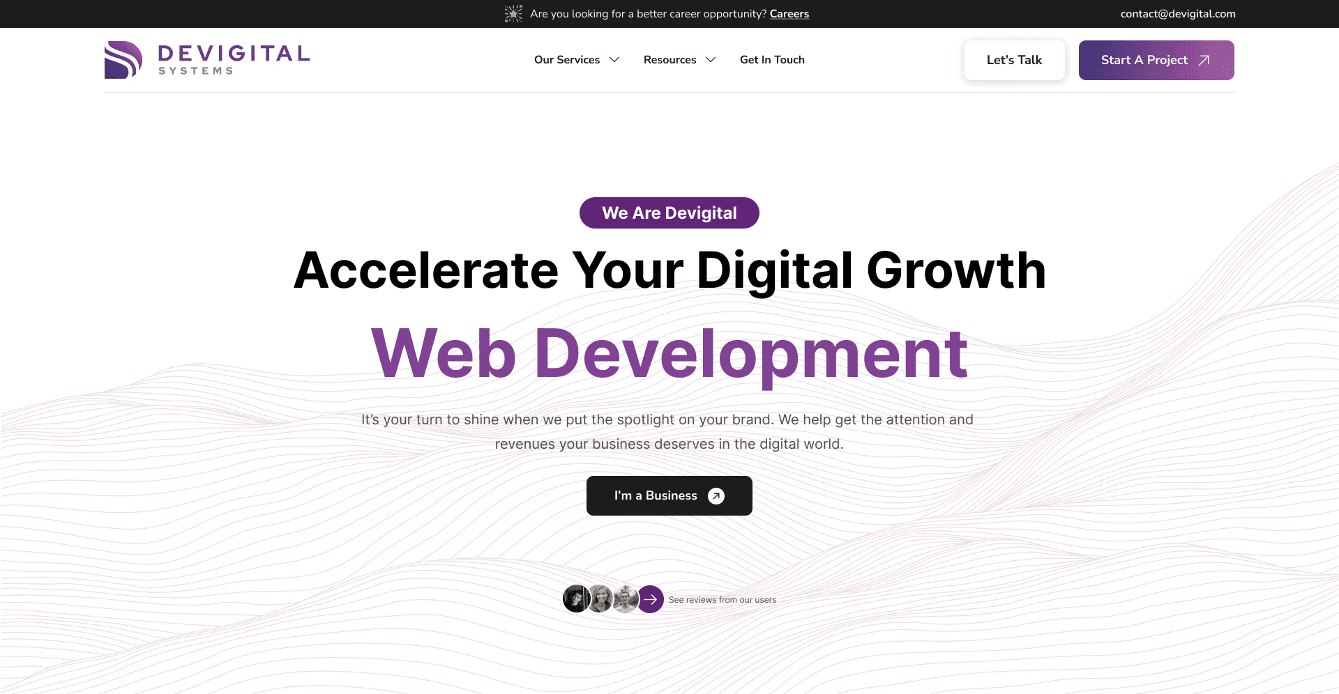
1. Clear Value Proposition and Hero Messaging
We rewrote the homepage to immediately communicate Devigital’s core mission and services: helping businesses digitally transform through expert software design and development. This included a concise headline, supporting subtext, and early placement of key services (UI/UX, Web Development, App Development).
2. Reorganized Information Architecture
We restructured the information hierarchy to be more intuitive:
Services grouped by business outcomes (digital design, development, enterprise services)
Case studies surfaced prominently with visuals and key metrics
Contact and conversion CTAs placed consistently across pages
3. Engaging Case Studies Framework
Rather than listing case studies in a block list, we created a case study pattern with:
Challenge → Solution → Results format
Visuals, metrics, and client testimonials
Clear filters for industry or service type
This makes it easier for users to find relevant work examples and see real impact.


Challenge :
1. Balancing Technical Detail with Clarity
Devigital serves both technical and non-technical audiences. A core UX challenge was presenting detailed service capabilities (e.g., UI/UX design process, development stack) without overwhelming visitors—especially business decision-makers. We tackled this with progressive disclosure and modular content blocks.
2. Mobile Experience
The previous mobile experience lacked clarity and easy navigation. We redesigned the mobile structure with sticky CTAs, simplified nav patterns, and accessible touch targets to ensure a smooth mobile browsing experience.
3. Case Study Discoverability
Though Devigital had strong project results, users weren’t finding them. The challenge was creating a unified portfolio structure that was filterable, browseable, and visually engaging—while keeping performance optimized.
Summary :
The Devigital Systems website redesign addressed core challenges of clarity, conversion, and discoverability. By restructuring content, enhancing visual design, and prioritizing business user needs, the new site communicates Devigital’s expertise more effectively. The improved UX supported higher engagement, stronger lead generation, and stronger alignment between the company’s brand promise and the user experience.


Web Design
Devigital Systems
Devigital Systems is a top-tier service provider company with decades of experience
Year :
2023
Industry :
Tech
Client :
Devigital Systems
Project Duration :
9 weeks
Problem :
Devigital Systems is a technology consulting and software services company providing UI/UX design, web and app development, and enterprise solutions to global clients. However, their existing website was not effectively communicating their value, service details, or case studies in a way that guided users toward engagement and conversion. Users struggled to understand their core offerings, differentiate Devigital from competitors, and find relevant case studies or contact paths.
Key Issues Identified:
Lack of clear service storytelling and hierarchical information
Case studies not easily discoverable or digestible
Navigation that wasn’t intuitive for business decision-makers
Weak conversion points for bringing visitors into leads
Solution :
1. Clear Value Proposition and Hero Messaging
We rewrote the homepage to immediately communicate Devigital’s core mission and services: helping businesses digitally transform through expert software design and development. This included a concise headline, supporting subtext, and early placement of key services (UI/UX, Web Development, App Development).
2. Reorganized Information Architecture
We restructured the information hierarchy to be more intuitive:
Services grouped by business outcomes (digital design, development, enterprise services)
Case studies surfaced prominently with visuals and key metrics
Contact and conversion CTAs placed consistently across pages
3. Engaging Case Studies Framework
Rather than listing case studies in a block list, we created a case study pattern with:
Challenge → Solution → Results format
Visuals, metrics, and client testimonials
Clear filters for industry or service type
This makes it easier for users to find relevant work examples and see real impact.
Challenge :
1. Balancing Technical Detail with Clarity
Devigital serves both technical and non-technical audiences. A core UX challenge was presenting detailed service capabilities (e.g., UI/UX design process, development stack) without overwhelming visitors—especially business decision-makers. We tackled this with progressive disclosure and modular content blocks.
2. Mobile Experience
The previous mobile experience lacked clarity and easy navigation. We redesigned the mobile structure with sticky CTAs, simplified nav patterns, and accessible touch targets to ensure a smooth mobile browsing experience.
3. Case Study Discoverability
Though Devigital had strong project results, users weren’t finding them. The challenge was creating a unified portfolio structure that was filterable, browseable, and visually engaging—while keeping performance optimized.
Summary :
The Devigital Systems website redesign addressed core challenges of clarity, conversion, and discoverability. By restructuring content, enhancing visual design, and prioritizing business user needs, the new site communicates Devigital’s expertise more effectively. The improved UX supported higher engagement, stronger lead generation, and stronger alignment between the company’s brand promise and the user experience.